00:00
00:00
DannyP

21 Art Reviews w/ Response

All 39 Reviews

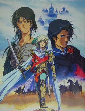
Could use a better background

I like how you shade with solid black. Quite a few of the lines look pretty rough or rushed, but I like how that looks, too. I don't think it would have the same cartoony charm with clean lines.
Cool design and stuff. I think the thumbs could maybe use some work, but the hands look pretty good otherwise.

StoneFeather responds:

Thanks :D I tried to make the lines look rough, but I do understand the background needing to be made better.

I like the simplicity

I think it's a pretty good picture, but you should try making different backgrounds rather than just using this orange/yellow exciting sunrise thingy all the time.
Also, I think it looks bad how you have the pirate cut off at the bottom and the zombie cut off on the bottom and to its left. Like, we can see the background where it should be covered... You should crop those edges of the picture, methinks.

StoneFeather responds:

Thanks for your helpful criticism, I chose the background because the first four were quick works, and the poor crop job on the left and bottom were due to Flash crapping out on me and not being able to do a final crop.

Good

It looks quite good, though a little unpolished/rushed with some of those rough lines and rough shading... it seems like there's just some general lack of attention to details. And this is definitely not pixel art.

NikkyRawrs responds:

Thank you for the criticism...and telling me it's not pixel art...totally understand, I'm still new and I'm not sure how to categorize digital drawings... xD...
Explanation behind the rough lines and shading: I don't spend a lot of time on my drawings, and this in particular took me about an hour.

Thanks again.

UV rays

Looks good overall, but is there any reason for all that white space? Also, his hips look a bit wide to me... like, feminine. And I don't really understand the purpose of that lens flare... I bet tons of people would put it on his belt buckle, but why in some miscellaneous white space? If it's the sun, I don't think it reflects all the shading too well... I think you did a good job with the arms and clothing folds in particular.

ZachsAnomaly responds:

I always do white in the background 'cause I'm a fruit loop. LOL.

And he's weird in the anime 'cause with his clothes on, he has GIANT pants that're extremely wide in the hips but when he takes his clothes OFF, he's a stick figure---he's got like.... an attachable ass or something that comes with his clothes. I have no idea~ Pokemon's strange that way~

Sorta amusing

The dancing thing is good, but this looks rather poorly made. You shouldn't use so many unnecessary colours in pixel art.

Daverom responds:

why?

Cool

Description made me laugh a little. Awesome drawing. He sorta reminds me of Marth, though... like, an evil version.

kiiryu responds:

Actually, he was originally inspired by Daryun off of "The Heroic Legend of Arslan"
http://users.atw.hu/johnim/nemonic/pictures/Arslan%20Senki.jpg
HE looks like marth. (the guy on the right)

I saw it when I was like 7, so it had a big impact on the designs of most of my characters.

Short

He looks short... I dunno if that was intended. I'd like it better if his legs were a bit longer. The colours used remind me of Final Fantasy Tactics. The design is sweet. The higher hand looks smaller than the hand with the sword, or at least the fingers don't look to be the same thickness.

kiiryu responds:

I think he looks short because the thing around his waist is too low. And yeah, I agree with you on the hands.

Awesome

I'm not entirely sure how I feel about those pencil-like lines... Other than that, this looks awesome. I had no idea where this character was from until I looked at some of the reviews; now you've got me tempted to watch Avatar.

kevinsano responds:

pencil-like? They're just pencil XD

Glad you liked it, now go watch Avatar :D

Good

It's good, but that blush looks overdone and out of place. I think the legs look very thick considering how young this character looks.

kevinsano responds:

yea, I tried something new with the blushes, but leave them legs alone D:

Good

Kinda disturbing. Looks quite good overall. I think the blush on the sewer is a bit much, though. Also, I think her ear should be moved over the left... It should be, like, in line with where her jaw ends, I believe.

exninja123 responds:

thanks! :)

I have webcomics on my website.

Danny Poloskei @DannyP

Male

Saskatchewan, Canada

Joined on 11/5/04

Level:
26
Exp Points:
7,130 / 7,510
Exp Rank:
5,664
Vote Power:
6.75 votes
Art Scouts
2
Rank:
Corporal
Global Rank:
1,917
Blams:
1,606
Saves:
2,992
B/P Bonus:
22%
Whistle:
Normal
Medals:
122